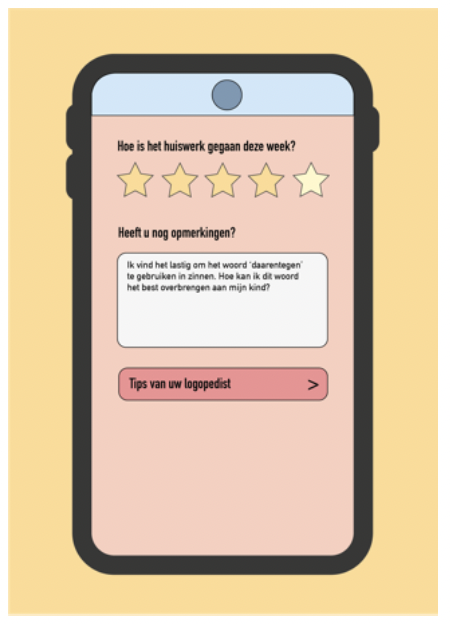
Now that I had created a color palette, I could get to work creating prototypes for our concept. I personally fully developed the app 'TIPS & TOS', this interactive prototype can be seen by clicking on the link below:
TIPS & TOSAfter creating this prototype, I tested the app with several parents who fit within the target audience. The app was also tested with a speech therapist. I will list the important findings from this below:
- There is a lot of need for the feedback option that the app now provides.
- There is a need for the app, but parents would also like to have something tangible.
- Parents like that the homework can now be found in the app.
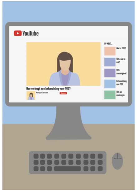
- The videos are nice to watch together with your child.
- The progress function is also very popular, parents would like to see a reward system.
- The colors are cheerful and not too present.
- The homework assignments in the app correspond well with homework assignments the parents have been given for their child.
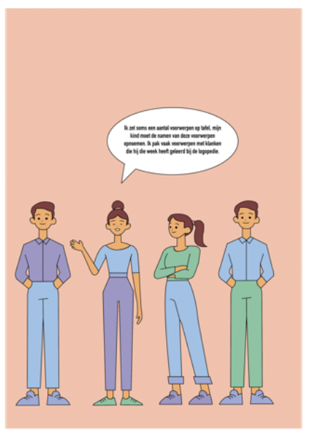
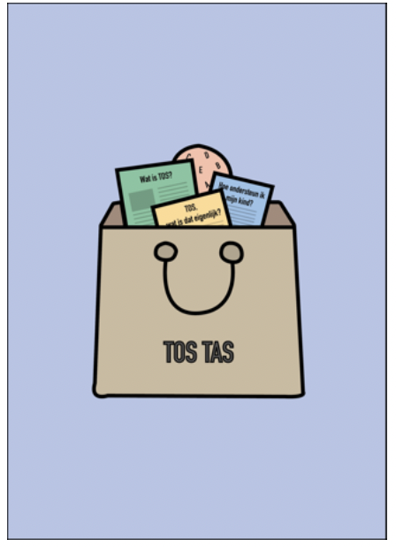
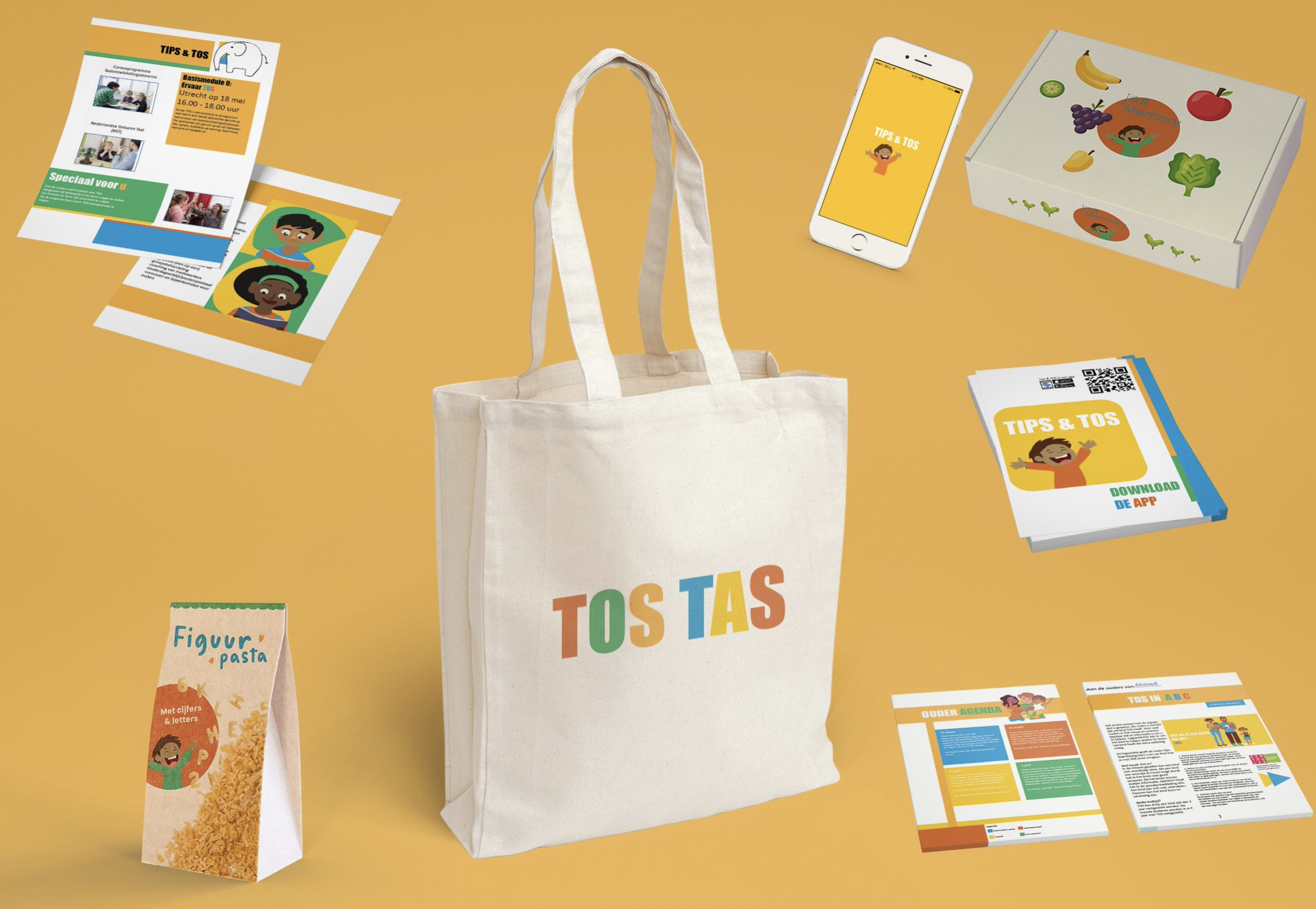
To address the second feedback point, Nienke Vos elaborated on the concept of 'TOS TAS' in another visual way (Fig. 5). Together as a team we have developed this concept a bit more broadly. We added some more physical elements next to the TOS TAS, you can also see these in Figure 5.